Old Original Logo
(Crude Eagle with tiny "turkey head;" wings span entire oval, etc.)
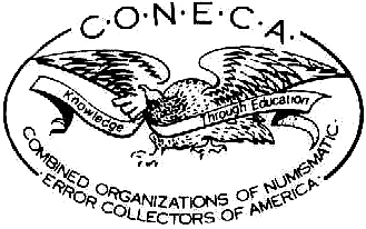
CONECA Logos
Old Original Logo
(Crude Eagle with tiny "turkey head;" wings span entire oval, etc.)
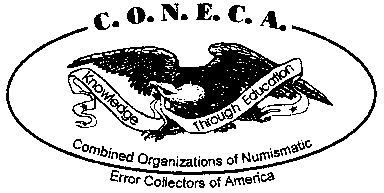
Current Logo
(Eagle is "muddy," wings do not span entire area available, etc.)

Proposed Logo (fine-line draft)
(Eagle is well defined and logo is made round to fit better on medals, etc.)
Gentleman,
Motion: I, Ken Potter, make a motion
to the Board that we approve continued work on the proposed design shown above as a
"round" CONECA logo, and that it be used on the CONECA 20th Anniversary
medal. This design will not necessarily replace the older logos but may supplement
them at the discretion of the board if deemed desirable for other uses.
Discussion: In working with my engraver to create the
CONECA 20th Anniversary medal, I ran into several problems associated with the layout and
quality of the current CONECA Logo. First, I was told by the engraver that the logo
was too "muddy" lacking in the definition required for him to cut a die with any
firm idea of what we wanted. If you look at the current logo you really cannot make
out the details of the eagle's beak, claws, tail feathers, the tips of feathers are
indistinct, the tail feathers are a "blob," etc. He indicated that over
the years he has learned that it is best to not second-guess what somebody wants. He
requires better art than what I could supply. He indicated that he could work-up
that art (for approval) but that it would take time as he was overloaded with other jobs
to engrave dies.
As a result, I hired a local artist, (cheap - because he works in the
art department of DCX and I am his Inspector when he is on the "floor" working
overtime), to draw up a fine-line sketch of what was needed and from which the engraver
could work in the finer details such as individual feathers, etc. In doing this the
artist took the liberty of making a few minor changes that he thought improved the design
in areas of the ribbons, etc. He also noted that the current logo with the "small
eagle" which is considerably smaller than the oval in which it resides, was going to
end up too small to show up on a medal to best advantage, (like it could if it's wings
spanned the entire area of the oval -- as was the case with the original logo). He
also suggested that we'd be far better off with a round logo than oval logo for use on
medals (and in general) as designs could be worked to better advantage in this manner.
I have discussed this consideration with James Wiles who felt that it
would be a good idea to adopt a round version of the logo. We have considered, for
example, that the ANA has made many logo changes over the years and when they were
introduced, advised members that the the newer ones did not necessarily replace the older
ones or make them inappropriate for use (thus you will see a variety of ANA logos in use
in dealer ads, etc.). In a like manner, we can approve of a new round logo and
continue to use the older oval logos if desired.
Please note that the proposed logo is a very rough-draft created
by me using the fine-line drawing supplied by my artist with legends cut out and pasted in
from the current logo. This rough draft does not show the bold lines that are more
appropriate to a logo. This is a fine-line drawing that will need to be strengthened
later if we are to use it in a logo. Additionally, the engraver is working with it
further and will change the positioning and size (and perhaps font) of the legends to fit
the round format. He will reduce the size of the circle so that the eagle's wing
tips extend a bit further outside and he will modify the ribbon, to the left, so that it
falls within the circle. (The "extended wing tips" will give the logo more
character and act as a "separator" for the legends that will go around the logo
to commemorate the event). He will add the two stars that were at the ends of the
ribbons in our original logos (I'm guessing they had some significance). I have also
taken the liberty to add in the date of the club's formation. I believe most or all
of you will agree that we have matured to the point that we should be proud of that date
and display it prominently. This will let folks know that we are "the
original," so to speak, and not some recent "Johnny come lately" that is
here today and possibly gone tomorrow.
We can simply table this discussion and use the "improved
eagle" within the current oval layout if desired. However, we do require a
better eagle and not using it one way or the other is not an option if we are to produce
the medal. I presume I already have approval to use the "improved eagle"
based on the earlier motion approved if it is maintained with the current format.
Still, I'd prefer to work with the new round layout if possible.
Does anybody second this motion?
Sincerely yours,
Ken Potter